Post Mortem


Bound Directions was a short puzzle game made over the course of 30 hours. It was my first game made using puzzlescript.
The Good:
Puzzlescript is an excellent game engine at making games about pushing blocks. I can't overstate its goodness. It's so fast to work in. If I'd made this game in unity it would have taken 1-2 weeks, and would have been a 20mb file instead of a 1/3mb file. I have no regrets in engine choice, and I'm going to use this engine way more often. I'll probably suction off some of its design for use in custom level editors for bigger games.
The core rule (characters who can only move in the directions they point in) led to some really nice and interesting puzzles.
The game was well received by a majority of playtesters I polled.
There were a few standout puzzles that I was very happy with. The finale, Smuggling 1, and Crossing 3 were all, mm. Tasty.
The bad:
I didn't playtest (like I usually do) on players with low level's of puzzle literacy. After getting positive feedback from experienced puzzlers, I decided to call it a day and publish, because they like it, so it should be fine!
Alas, upon encountering the released game, multiple players told me that they didn't understand THE CORE RULE of the game! Ahh! Disaster. This is a catastrophic problem.
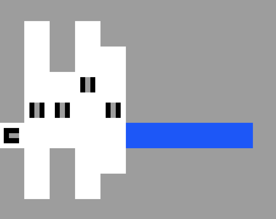
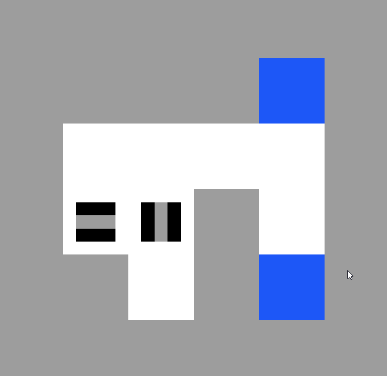
The core rule is that the black cubes are only allowed to move in the directions they point in, and people didn't pick this up. Why did my game fail to effectively teach this rule to a subset of the audience? Two reasons.
Firstly, Frankly, the first 4 puzzles in the game are the worst puzzles in the game. Usually, when designing early puzzles I want them to serve at least 1 of 2 purposes:
1. Demonstrate a rule to the player.
2. Prevent the player from continuing until they understand the rule.
My early puzzles demonstrated the rule, but very very poorly because they didn't include enough symbol types; a forgivable sin, maybe. Worse! My early puzzles didn't allow the player to demonstrate understanding, because some players (including myself as I playtested) could find the solution by just kind of slapping keys and stumbling into success for the first 4 puzzles.
So in summary, my first 4 puzzles didn't properly demonstrate the rule, and they allowed players to enter the dangerous territory of puzzles that require players to understand the core rules to attempt them. Whoops!
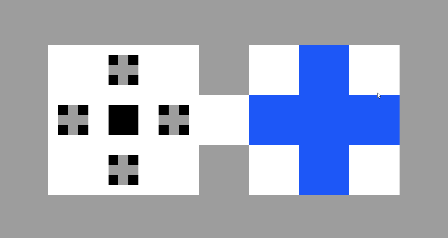
To solve this, I should have let go of my desire for the crossing level's to form a cute symmetrical pattern, and properly tutorialized the core mechanic over several levels.
The ugly:
I think if I made the grey of the core symbols one pixel bigger they would have been slightly easier to read for players. I'll add that graphical change if I do a sequel / remake of this idea.
Marketing:
After a day and a bit, the games stats are:
29 views, 15 plays, 0 ratings, 0 collections, 1 comment, 575 impressions, 2.09% CTR.
These numbers are tiny, and that's fine! I mostly designed this game for my own growth, so the fact that my plays are low matters not. The stats from this game are going to be a really useful baseline when I work on similar projects, with differing levels of press push.
TL;DR Playtest your game on players who are new to your genre, don't let cute patterns get in the way of effective game design, shoot giant lasers from your eyes.
Files
Bound Directions
Puzzlescript game about multiple characters.
| Status | Released |
| Author | Croubble |
| Genre | Puzzle |
| Tags | 2D, Abstract, DRM Free, Minimalist, Non violent, PuzzleScript, Short, Singleplayer, sourcecode, Turn-based |
| Languages | English |
| Accessibility | Color-blind friendly |
More posts
- Raw marketing stats + observationsJun 11, 2019
Leave a comment
Log in with itch.io to leave a comment.